The Central Academy of Fine Arts, the earliest state-run art academy in China, celebrated its hundredth anniversary this year. On March 22nd, 2018, the “CAFA Centennial Celebration Press Conference” officially announced the Centennial Celebration Logo of the Academy—The Arabic for 100 is divided into two parts; embedded in the middle negative space is the chief logo of the Academy, while arranged vertically on the left side is the English acronym “CAFA” and a line of small characters that reads “1918-2018 A Hundred-Year Glory.” Hereafter, as the most critical visual image of the celebration, this logo has frequently appeared in numerous activities among CAFA. The designers are two teachers from the CAFA School of Design: Wang Jie and Chen Weiping.
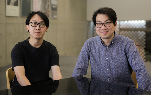
The interview was scheduled for the café at the CAFA Art Museum. Right on the eve of the undergraduate graduation exhibition, the art museum was like a noisy factory in the background with the preparation and arrangement of the exhibition being arranged, so we started our conversation in a relatively quiet corner. Chen is from Hong Kong. Although he has studied and lived in Beijing for more than ten years, his Mandarin still retains an accent. Wang was born in Taiyuan, Shanxi province. Despite the fact that one is from the South and one is from the North, their partnership has gone surprisingly well: the two were fellow apprentices in the School and both chose to stay on campus after graduation and taught in the Department of Visual Communication. During the interview, they chatted amiably with no hurry, talking about their design concepts in clear, easily understandable words, and never forgetting to add a few sentences for each other when needed. Apparently, they are close friends who have collaborated for many years.
On the Design of the Centennial Celebration Logo:
“What we need is a visual image that not merely possesses Chinese characteristics but also embodies a contemporary international perspective.”
Last February, less than two months before the opening of the celebration, Chen Weiping and Wang Jie were appointed to design the CAFA Centennial Celebration Logo. In order to fulfil this important task, they seized every possible moment to discuss and perfect their draft design, producing nearly twenty versions in such a short period of time. For instance, they had once considered to prioritize “A Hundred-Year Glory” over other elements, and also tried to combine the derivatives of the word “百hundred” using graphics. For better understanding of the history and tradition of the Central Academy of Fine Arts, Chen scrutinized materials at the CAFA History Museum in the early days of the logo design, exhaustively teasing out a series of visual images such as iconic emblems based on the chronology of the academy and attempting to find inspiration from them. Among all of his findings, the CAFA emblem designed by Mr. Zhang Guangyu in 1950 won his favor. The primary visual image of this emblem was a tree. Since in Chinese, the word “美术fine arts” sounds like “美树great trees”, and “树tree” could also be extended to indicate the idea that “百年树人it takes a hundred years to educate people.” But in the end, this plan was not adopted.
Wang spent his undergrad years at the Central Academy of Fine Arts. As an alumnus who personally experienced the relocation of the Academy from Beijing No.2 Radio Factory to Hua Jia Di, he highlighted that while contemplating how to express the spirit of the generations of CAFA alumni in design and integrate it with the new logo in the meantime, the coordination of accuracy and systematic design was extremely crucial. “After repeated discussions, our clue become increasingly clear, what we needed was a visual image that not merely possesses Chinese characteristics but also embodies the contemporary international perspective.” Chen added. After several revisions, they finally determined the Centennial Celebration Logo that we see today—featuring the Arabic numeral “100” as the keynote, the number is divided horizontally into two parts, symbolizing the past and future of CAFA’s hundred-year glory; Embedded in the middle negative space is the chief logo of the Academy, while the left side is comprised of the vertically arranged English acronym “CAFA” and a line of small characters that reads “1918-2018 A Hundred-Years of Glory.”
With the impact of various emerging media, the concept of brand nowadays is no longer confined to a certain fixed image in the traditional sense, but rather inclines to signal a complete, recyclable “system.” Just like the design of this Centennial Celebration Logo, which used the central negative space as the text area for a series of activities and defined the boundary of this area with a thin wire frame that was consistent with the main logo, it provided more possibilities for the extension of the visual image of the hundred-year glory. In the series of CAFA celebration activities, we observed that whether it was the undergrad graduation exhibition or other events planned by the Academy, all consciously employed the design of this logo. The usage of the main logos had distinct gradations, ensuring a unified coordination between the serial exhibition activities and the main logos. As a result, the image of the main logo showed up constantly within this system, improving the popularity of visual power.
On the Design of the 2008 Beijing Olympics:
“That is not a simple refinement, but rather a way to unite modern design language with traditional Chinese culture and translate and present them appropriately.”
Chen Weiping and Wang Jie are not new to visual system design of large-scale events like this sort. After Beijing’s successful bid for the Olympics, the Beijing Municipal Government partnered with the Central Academy of Fine Arts to establish the Art Research Center for the Olympic Games in 2003. With great honor, the two artists participated in the related designs while they were still taking master courses at the CAFA School of Design: Chen was in charge of the core graphic design as well as the landscape design of the torch relay of the 2008 Beijing Olympics, whereas Wang was responsible for the sports icon design of both the Olympics and the Paralympics.
“This is actually a very complex system design, especially as our generation of designers grew up learning Bauhaus, yet the Olympic landscape design requires thorough comprehension of traditional cultures.” Wang said, the question was how to place these impressive cultural foundations in the context of modern design, “that is not a simple refinement, but rather a way to unite modern design language with traditional Chinese culture and translate and present them appropriately.” In the end, the CAFA design team polished the auspicious cloud patterns depicted on the Dunhuang caissons to shape the core graphics of the Olympics; including the Chinese mythological image “phoenix” in the creation of the landscape design of the Olympic torch; they took the seal script strokes as the basic form, adding the hieroglyphic interest of other ancient Chinese writing systems such as the oracle bone scripts and bronze inscriptions as well as the simplicity of the modern graphics to devise a whole set of sports icons for the Beijing Olympics.
The entire design lasted for three to four years, and corresponding images were always in need whenever the project reached certain points. In light of this, designers had to apply the overall notion of the system design, taking great pains to meticulously perfect these designs. The Olympic Design Project not only called for designers’ philosophies, but in essence, it had a research nature. Since it was a long-term, high-intensity project, most design companies or designers were unable to afford it. However, the strong resources and outstanding academic profile of the Central Academy of Fine Arts provided possibilities for the prolonged design cycle of the Olympics—experts from different disciplines could offer insight and make assessment, an unparalleled competitive edge that no commercial organizations could ever be equipped with. “In the design process, prestigious old scholars of the Academy made a lot of pragmatic suggestions and lent sufficient support to the design no matter whether the topic was the design concept, humanity or styling. In regard to the interpretation of calligraphy, we could ask the people that teach this subject for guidance. As for traditional Chinese patterns, we could also find professors who specialized in this field. Academic support like this was indeed quite powerful,” Wang commented.
On the Extension of Design
“In this era of ‘becoming,’ everyone becomes a newbie and the expert is absent.”
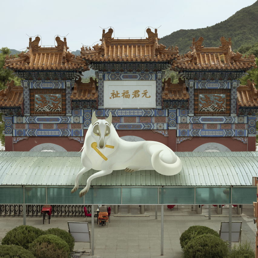
In addition to brand design and interactive design, Chen Weiping and Wang Jie had participated in other designs as well, including book design, product design, exhibition design and so on and so forth. Chen was particularly interested in reinterpreting the classical exhibitions of the time-honored Chinese calligraphy and paintings with the technique of contemporary designs, presenting old propositions through the usage of an updated cultural perspective and a brand-new interactive mode and was involved in the show as a media artist. Speaking about diverse cross-disciplinary operations, situated in the era of rapid media and technological development, the acquisition and sharing of information has been becoming increasingly easier. Designing is not a closed-door process, it demands designers to constantly get in touch with any and every burgeoning newcomer. “I used to be afraid of trying certain projects in the past, but now I find it is not that difficult. The hardest part is in fact of whether you have the incentive or not,” Chen voiced, “The question lies not in taking actions but thinking instead.”
In recent years, Wang has dedicated his time to study the reflection of artificial intelligence on design methods, opened an interactive course entitled “Think Like a Machine”, and began to use products as a design output to face a broader user group. In the meantime, he has also turned to the interactive design in curations, “An exhibition resembles a huge interactive design project.” Wang believed: “The best thing of this era is the absence of barriers between different disciplines. The outdated, conservative assembly line and industry model left by the traditional industries have begun to collapse, allowing many present-day ideas to quickly find the possibilities to reach fruition.”
The functional and value attributes of design itself determine the difference between design and pure artistic creations. Since design in the contemporary era is not a matter of simply considering design itself, does it need to compromise? In Chen’s eyes, contemporary design entails regular media criticism, improvement, and upgrading, thus it is natural to make a compromise within a reasonable scope, “This is not a design condition, but a compromise induced by environmental factors.” Designing has already managed a way to cross the boundary of disciplines, and the transboundary has already become an unchangeable trend. Besides getting equipped with superb professional skills, designers also ought to put more weight on things like communication methods and rapid media changes as well.
It is impractical to stick to the traditional proverb “Good wind needs no bush.” in the era of information explosion. “Designers need to be familiar with media and their means of communication and know how to reach good designs for ordinary subjects, but there is a gap in these processes.” According to Wang, design has nothing that contradicts with communication and good design should be attached with enough importance and be properly promoted. At the same time, designers have to continue their education and pay attention to self-reflection because there is no such thing as life-time skills. Just as Kevin Kelly wrote: “In this era of ‘becoming,’ everyone becomes a newbie, and the expert is absent.”
On Their Identity as CAFA Teachers:
“Students will exceed your expectation as long as you provide enough stages for each of them.”
Putting their identity as designers aside, Chen Weiping and Wang Jie are teachers at the CAFA School of Design. In general, as students who are able to be admitted to the academy often have already had a solid foundation in terms of professional competence, Chen and Wang emphasize the cultivation of critical thinking and analysis in teaching the undergrad courses. Design cannot be taught one to one through imitation. Instead, it guides students to brainstorm things that are beyond the rational from a critical designing point of view. “I may not be fond of students who behave rather conventionally,” Wang stated, students will be suppressed under a standardized teaching system, “yet in disciplines of design and fine arts, we need some rebellious spirit.”
Unlike traditional styling subjects that focus on the performance of artistic techniques and aesthetics, Chen underlines the inclusive element and openness of art when teaching design courses. “I hope that students can explore media through interactive design, and thereby master the creation method and design thinking,” Chen noted, “Teaching students methods is a big problem itself as methods are always changing. Hence it is imperative to teach them how to find methods, especially for graduation projects, letting them explore their own paths and creative inspiration.” Excellent designers should have a broad horizon which coincides nicely with this notion, the basic teaching principles of the academy are to encourage students to break down barriers and set zero boundaries. Chen went on to say that in the design process, we may discover the necessity of learning many seemingly irrelevant subjects such as mathematics, chemistry, biology, etc., and the study of these subjects will eventually turn into the nutrition sources of design thinking.
It was right in the middle of the CAFA graduation season, when they were asked about the attitude towards the students, both Chen and Wang spoke highly of them. Wang indicated: “Students at the Central Academy of Fine Arts are all preeminent. They will exceed your expectation as long as you provide enough stages for each of them.” Always keeping faithful to your original will but do not be restricted by norms and conventions, this is the beautiful message that the two teachers gave to those who are about to graduate.
Text by Lin Jiabin, translated by Paris Yang and edited by Sue/CAFA ART INFO
Photo by Hu Sichen/CAFA ART INFO
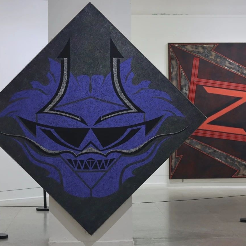
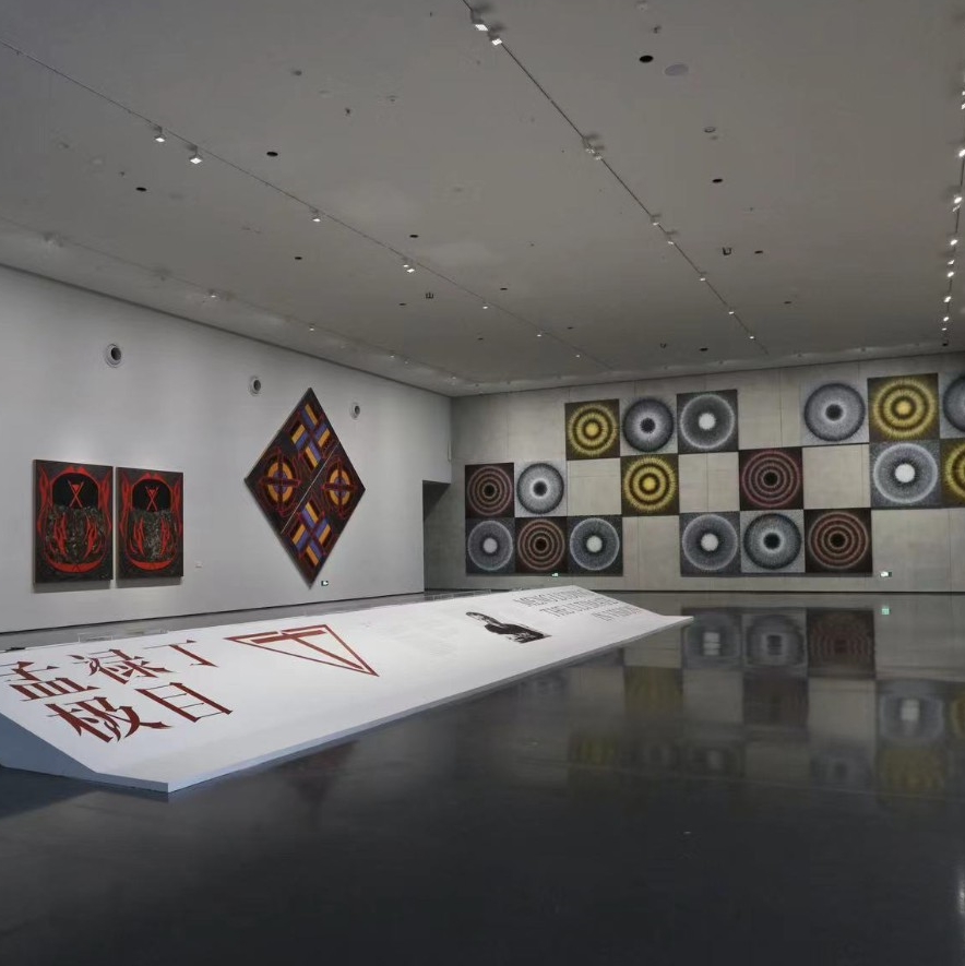
(Images of the designs were provided by the artists)


