 Portrait of Ms. Theodora Mantzaris in 2022
Editor's Note:
Beijing has officially become the first “Dual Olympic City” after the Beijing 2022 Winter Olympics and Paralympic Games were successfully held. In addition to the deep impression that athletes have left on the spectators across the world, the Olympic design project worldwide with unparalleled media coverage once again illustrated the significant role that great design played.
As it is widely known, each Olympic Games has its own character which reflects the influence of the people, culture and history of the host city and country, what’s triggering off our interest are how Olympic design project of the Beijing 2022 Winter Olympic Games works and develops with the supervision of the Organizing Committee for the Olympic Games (OCOG), to what extent it can be regarded as a successful one and the future influence it may exert on designers. We were honored to have input from Ms. Theodora Mantzaris, an IOC advisor from OCOG who supervised the design teams for Beijing 2008 Olympic Games and Beijing 2022 Winter Olympic Games and she shared with us her comprehension, thinking and experience from the perspective of Olympic design history.
Theodora Mantzaris is the world’s leading Design Director for major sporting events. She led the design team of the Athens 2004 Olympic Games and she became the Design Advisor to the International Olympic Committee on all subsequent Olympic Games. Throughout her career, Theodora has been recognised for her accomplishments. Educated at the world’s top design institution, the Royal College of Art in London, she completed executive leadership coursework at Harvard University and she has also studied at Guildhall University, Marketing (Chartered Institute of Marketing).
Interviewee: Ms. Theodora Mantzaris
Interviewer & Editor: Sue Wang
Interview Date: February 26, 2022
Photo Courtesy of Ms. Theodora Mantzaris
CAFA ART INFO: Being a designer for the visual identity of the Athens 2004 Olympic Games and later an IOC advisor, what do you think are the standards to adhere to in regard to the visual identity for the Olympic Games to be successful?
Theodora Mantzaris: The beauty of the Olympic Games is that each edition is taking place in a different part of the world. This is an opportunity for the Host Nation to project its distinctive national attributes while the values of Olympism are enriching the identity of the Nation.
The Olympic project is by default a “Branding the Nation” project. This was evident to me from the beginning of my work in the Athens 2004 Olympic Games. Prior to that position, I was working with Wally Olins in London, where I experienced first-hand his pioneering thinking. I was fortunate to work on his projects and transform his vision on paper creating the visual language of the projects we were working on together. Wally Olins is the identity expert who “invented” Place Branding. In the Wally Olins books one can read about the relevance and interconnectivity of all actions or inactions of a Nation that create the Identity of the Nation in the specific, targeted groups of people in the world. The Olympic Games is one of the most effective communication channels to promote the attributes of the Nation, a Nation that wants to reach the global Olympic audience of billions.
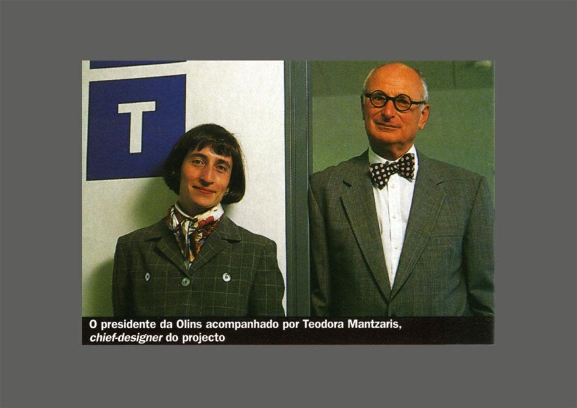
Theodora Mantzaris and Wally Olins
In the book “Olympic Games – The Design” by Markus Osterwarlder, one can easily see the brilliance in design expressed in the Olympic Games visual identities. The visual identities that are most memorable are those that were led by competent designers who also had strong managerial skills. They also had the drive and commitment to deliver good design and at the same time knew how to empower the top management of the Organising Committee to embrace and approve the design proposals at hand.
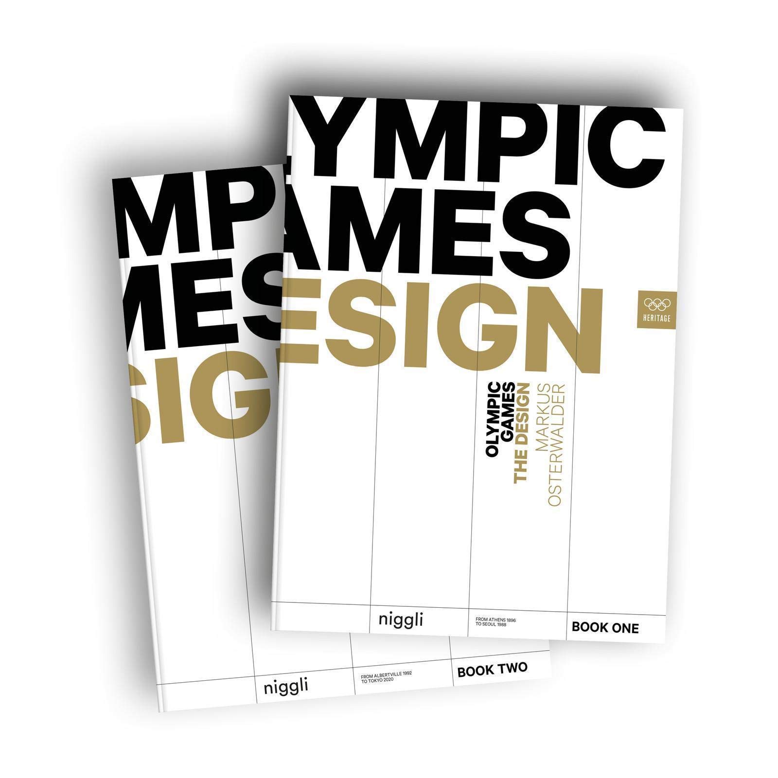
Olympic Games – The Design (2019) is the first book to focus in detail on the visual identities of all Olympic Games since Athens 1896.
Design and design alignment are key factors in the success of each Olympic Games edition. It is very common for OCOGs to waste a lot of time, even years, to finally understand the fact that the Designer or Creative Director is the one that has the power to deliver brilliance or failure depending on their ability. It is also very common for the Designer or Design Director in an OCOG to be very low in the hierarchy of the Organisation. In addition to that the IOC takes a neutral position on that matter. This is a limiting factor in the delivery of the visual identity and Look of the Games in so many editions of Olympic Games.
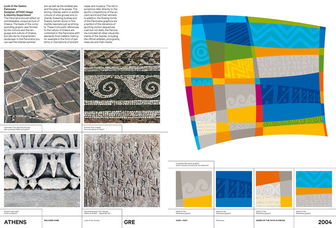
A page from Olympic Games – The Design, Source: https://www.theolympicdesign.com/
The Olympic Games visual identity is the dream project of every graphic designer in the world. I am one of the privileged ones that made my dream come true. In the Athens 2004 Olympic Games I had the unique opportunity to handle every single project, so now I am in the position to say that every line drawn, was under my creative direction. I defined the vision and values, designed the Emblem, and built the Organising Committees inhouse team to deliver the plethora of projects required in this massive Olympic design project. I was also able to place the Image and Identity Department in the Office of the President. A position that is so important to the alignment of the identity delivery. In that way all Athens 2004 Organising Committee departments had to follow the central creative direction. As I mentioned before, this was a unique situation. It was unique because the ATHOC top management was ignorant of design issues but they were also very open to admit it so they entrusted the whole project to myself as the expert.
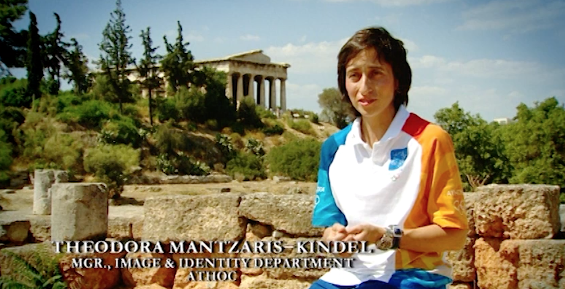 A Screenshot of Theodora Mantzaris in the Public Program for the Athens 2004 Olympic Games
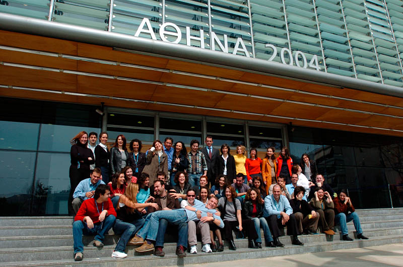
The Design Team Led by Theodora Mantzaris for the Athens 2004 Olympic Games
After the Athens 2004 Olympic Games, China offered me the opportunity to embark on the journey to empower and support the designers under the creative leadership of Wang Min. This was a great honour for me and I treasure every minute I worked for the Chinese team. I am also very fortunate to be part of the Olympic Movement since the first day I was hired by the Athens 2004 Organising Committee and still work on all Olympic Games editions, including the Beijing 2022 Winter Olympic Games.
The Beijing 2022 Winter Olympic Games visual identity and Look of the Games is one of the most effective and creative in Olympic design history.
A celebration of Olympism, by providing the perfect background to the athletes when in competition. The Chinese culture combined with the Olympic Rings are forming the most inspiring setting that sends a universal message of global unity and peace to the world. This is attributed to the power of good design and to a very strong Design Director: CAFA Professor Lin Cunzhen. Despite all odds (common to all Olympic Games) under her creative leadership, China presented one of the most culturally enhancing Olympic Games identity.
CAFA ART INFO: You had been invited to work with the design team led by Professor Wang Min for the Beijing 2008 Olympic Games and the later one led by Professor Lin Cunzhen for the Beijing 2022 Olympic Winter Games. During the working processes, what do you think are the parts that make you feel most challenging and most accomplished? And how do you think of the development between the two periods?
Theodora Mantzaris: I am so honoured for the opportunity to work with both of them and I am so happy to have two lifelong friends, both CAFA Professors.
Professor Wang Min is one of the best and most accomplished designers in China. An AGI member, with an immaculate international portfolio and experience in the field of visual identity. Professor Lin Cunzhen is a great designer with a world class portfolio including a vast Olympic design experience. She is the first woman designer in China to lead the Olympic design project in such a successful way. Both of them are exceptional graphic designers that also have strong managerial skills.
In 2008, China presented its first Olympic visual identity. The Lucky Cloud graphic, the exceptional sports pictograms by CAFA Professor Hang Hai and all the elements in the design system, communicated the immense richness, finesse, poetic attitude and artistry of Chinese culture to the global audience of the Olympic Games.
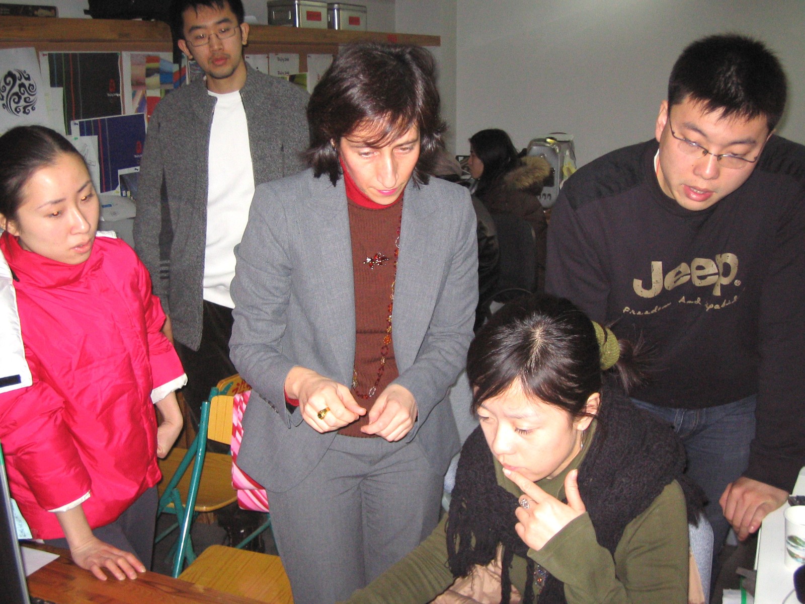 Theodora Mantzaris instructed the BOCOG 2008 Team.
It is very interesting to see that the two identities share the same cultural DNA but they are expressed in a completely different way. They are both borrowing elements from our natural habitat such as clouds, mountains and rivers; elements that were admired in the old, Chinese scroll paintings that back then, were used to express feelings and emotions, reflecting the richness of Chinese philosophy.
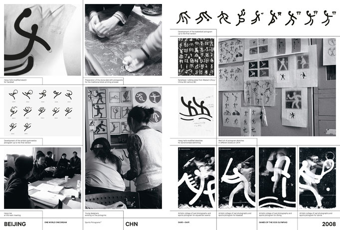
A page from Olympic Games – The Design, Source: https://www.theolympicdesign.com
When you are faced with the two secondary graphics you may even experience the difference in temperature of the environment they convey. The Beijing 2008 Lucky Cloud graphic creates a clear and warm summery atmosphere full of optimism for the future. The Beijing 2022 Mountains and Rivers graphic, on the other hand, is cool, inspirational and peaceful. Both visual identities are very appropriate for the respective Olympic Games. They are both engraved in all of our minds, the Nation attributes of Culture, respect to Olympic values and the welcoming Chinese spirit that is so unique and so giving. The Beijing 2008 Olympic Games showcased China honouring Olympism, a country that is open and friendly. The Beijing 2022 Winter Olympic Games presented a China that is peaceful but also a leader in the world of winter sports.
CAFA ART INFO: During the period of Beijing 2022 Olympic Winter Games, Bing Dwen Dwen as the mascot went viral in China, do you think it has fulfilled its function and what do you think of this phenomenon?
Theodora Mantzaris: Mascots are very important applications in the Olympic Games visual identity. They are great ambassadors to the Olympic Games especially to young people. Mascots present the most approachable communication channel and have the power to move our hearts and minds. Very few mascots are truly successful and stand the test of time. Bing Dwen Dwen is one of them.
It is the first Olympic mascot to go viral and to be adored by so many people. Bing Dwen Dwen is a Panda, an animal that one can only love. The intelligent designer added the “sugar coating finish” and the ability to fly, move in space, and connect with everyone in every Nation. This is the power of good, effective and intelligent design. The power to unite millions of people to express their participation in the Olympic Games and celebrate Olympic values.
CAFA ART INFO: What do you think is the breakthrough in the visual identity of the Beijing 2022 Olympic Winter Games from the history of Olympic Design? Do you think it will exert any influence on the future design of Chinese national image? Why?
Theodora Mantzaris: Every Olympic Games has the power to move the Host City and Host Country forward. They signify a period in time that the Nation, alongside other considerations, is striving to align its efforts with the essence and values of Olympism. The Beijing 2008 Olympic Games presented a vivid example. The visual identity produced was the first in China in that scale, that demanded alignment of so many items, applications, electronic, printed spaces, all required for an effective Olympic visual identity delivery.
Apart from the amazing visual identity, there is a vast amount of infrastructure projects, design projects at large, landscaping design, architectural design and other designs that took place during and after the Olympic Games that transformed Beijing into a green, a well designed modern and functional Metropolis.
The Beijing 2022 Winter Olympic Games presented a solid visual identity, that was derived from a strong team, again, powered by CAFA. This time the design work is more mature because it conveys the intelligence that derives from experience and talent combined. The design work at large influenced all aspects of design, leaving a valuable legacy in the local and global design community, and all together placed the country in the map of leaders in the world of winter sport. A great team of brilliant designers and officials working in harmony moving not only China but also the Olympic Movement forward.
CAFA ART INFO: “Winter Dream”, the emblem of Beijing 2022 Olympic Winter Games, behind Big Air Shougang during the competition of Ski Jumping has become one of the most recognizable identifications, which also encouraged the public to rethink its significance. It is not always easy to make a balance between the artistic quality and public perception, thus what do you think of the relation between contemporary art design and popular aesthetics from the perspective of Olympic Design History?
Theodora Mantzaris: The Beijing 2022 Winter Olympic Games Emblem “The Winter Dream” has left a lasting impression to me. It attracted my attention from the first second I saw it. I was confident that this is the best Emblem to represent the Beijing 2022 Winter Olympic Games.
It combines traditional and modern elements of Chinese culture and embodies the passion and vitality of winter sports. It is inspired by 冬, the Chinese character for “winter” and it resembles an ice skater at the top and a skier at the bottom. The flowing ribbon-like motif between them symbolizes the host country’s rolling mountains and Olympic venues.
 The Beijing 2022 Winter Olympic Games Emblem “The Winter Dream”
It is a multi layered Emblem full of meaning. It focuses on the endeavor of the athlete, and makes it a fundamental element in its design grid. It is an Emblem that works seamlessly in all applications. It offers great opportunities for broadcasting and photographic frames with the athletes next to its fluid shapes.
The calligraphic expression of the Olympic Games signature is also very elaborate, well-crafted and in visual alignment to the rest of the Emblem. A unique choice, distinct, very Chinese, in its visual communication especially when used in isolation. This is an Emblem that was made by a designer with great skill and attention to detail. It is easy to understand that it was crafted for very many days and every line drawn, every colour chosen, were put in place wisely.
The Olympic Games are a Celebration of Humanity. It is during the Olympic Games one can see in reality and in practice how sacred the Emblem is and how valuable it is in all of our minds. All of us want to be connected with it and we all know that its meaning and significance will create treasured memories reflecting the power of Olympism servicing humankind. These captured images of athletes in front of it, offer a unique experience; a glimpse into how wonderful the world can be when we live in harmony together. When we do our best in life and in the stadiums, when we respect each other and live life in peace. Winter dream is an exceptional Olympic Emblem. It is very lyric and artistic; it speaks an international visual language. These images created with this iconic statement will stay in the memory of humanity for ever.
CAFA ART INFO: Elements extracted from Chinese scroll paintings, were uniquely applied to fences around the ice arena for figure skating, short track speed skating. They looked fascinating when the athletes moved with them changing behind. The design is regarded as another highlight in Beijing 2022 Olympic Winter Games as it perfectly combined Eastern philosophy with Olympic elements. In addition to this, what do you think are the top three most significant examples during the interactive progress between the Olympic Design History originally from the West and Chinese Olympic Design according to your previous working experience?
Theodora Mantzaris: The Beijing 2022 Olympic Games brand identity design system is very modern, sharp and full of cultural references. The mountains and rivers graphic is inspired by masterpieces of Chinese scrolls. Scrolls full of poetic, cultural and philosophical connotations. The open horizon and mountain peaks, the flow of rivers, are a reflection of the old scrolls but they create a modern, dynamic yet idyllic setting for the Olympic Rings to be placed and highlighted in the venues. The colours were selected to reflect Chinese traditional hues and they have been adjusted to be broadcast friendly.
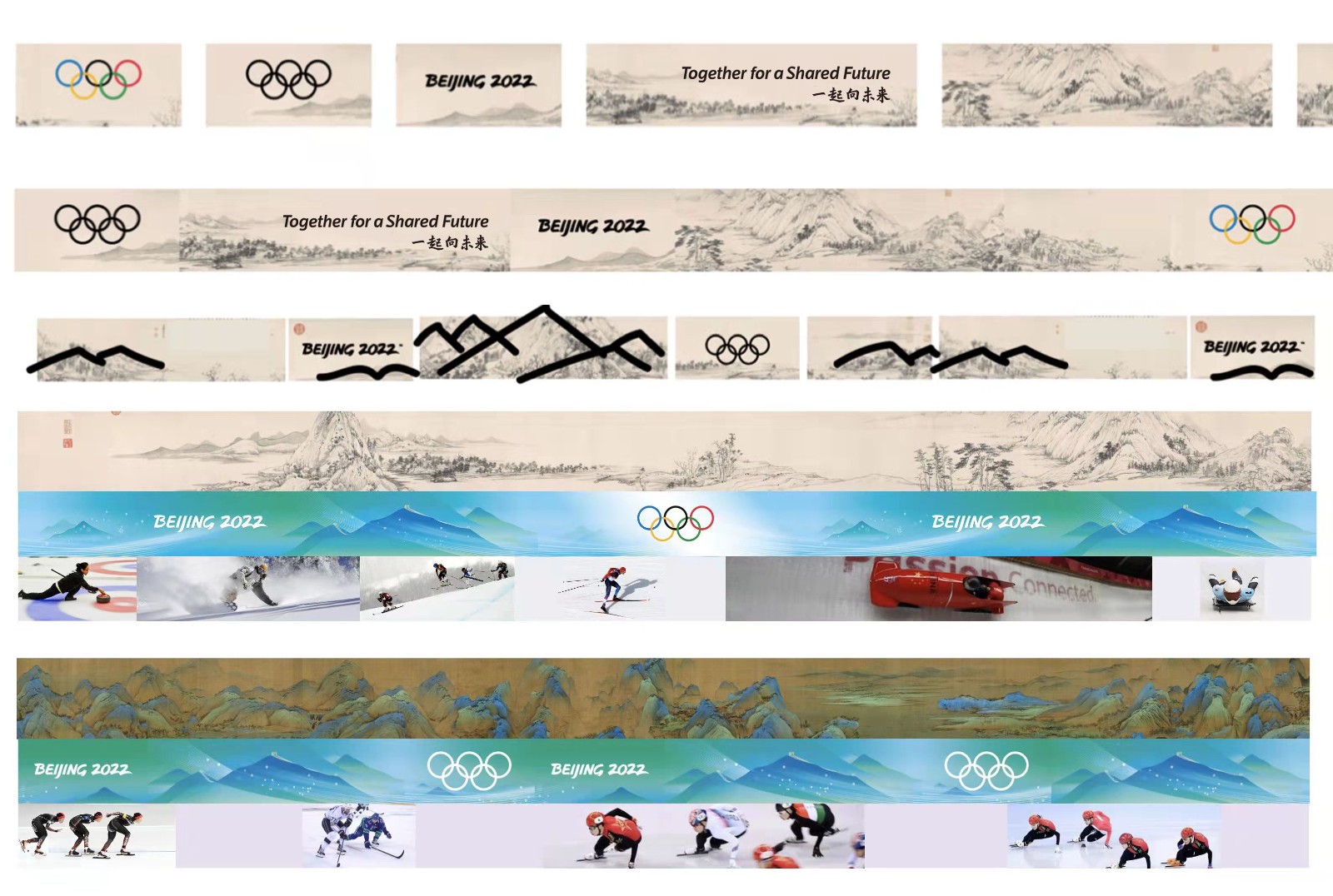 Graphic Design for Olympic Rings, Courtesy of Lin Cunzhen and the Design Team
What is exceptionally intelligent is that this graphic is in a linear form. Just like in the old traditional scrolls, the image of the Mountains and Rivers are in this format. The format of most applications in the Field of Play and in the Look of the Games. Another stroke of brilliance in the choice and expression of this secondary graphic. It is very important to know how this secondary graphic will be eventually applied when you first design it at the beginning of the visual identity project.
The snowflakes offered tremendous visual communication oportunities not only in the Look of the Games but also in the Olympic Games engagement front, with an interactive application to make your own personal design of the snow flake. In the Opening Ceremony these snowflakes presented the names of the Nations in the Athletes Parade and then all together created the Olympic Cauldron, a spectacular alignment visual iconography. The detail of the Great Wall, signals the characteristic landmark of the host City, a visual signature that gives to all applications and the Look of the Games a distinct locality that is so easy to understand today and to remember in the future.
The mountains and rivers graphic is also an Olympic first because it is animated in a rhythmical way, pleasing to the eye when broadcasted and when used in different applications. This animation was the first image we enjoyed during the first moments of the global broadcast of the Opening Ceremony, a great introduction for the rest of the visual identity that was about to be revealed during the next days of competition.
All work produced by the Beijing 2022 Winter Olympic Games will prove to leave a lasting legacy also in Olympic design, placing it among the great examples of design produced for the Olympic Games.
My other personal favourite design systems, (apart of the obvious choice of the Athens 2004 Olympic Games) are the ones from Mexico1968 and Los Angeles 1984 Olympic Games.
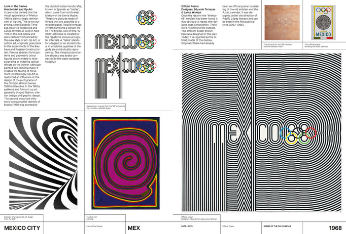
A page from Olympic Games – The Design, Source: https://www.theolympicdesign.com/
Mexico 1968 is a magnificent visual identity full of energy and movement. The design system introduced the language of stripes in sports graphics in combination with a set of strong visual national cultural references. Mexico shaped and presented the latest in design at the time, as applied in all its sectors, graphic, fashion, product, architecture and other. An Olympic Games visual identity that defined design in the 60’s and 70’s.
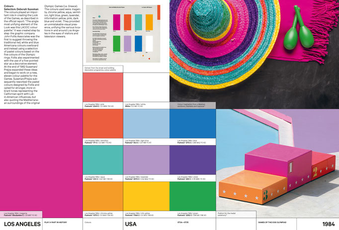
A page from Olympic Games – The Design, Source: https://www.theolympicdesign.com/
Los Angeles 1984 was also full of cultural references, reflecting American culture, with a fantastic expression of Memphis design and the most advanced and lively Look of the City that has not been challenged yet. A true brilliant system of a flexible visual identity that transformed LA into a great Olympic City full of joy and fun celebrating Olympic values.
CAFA ART INFO: Have you noticed any introduction of advanced design technologies in Beijing 2022 Olympic Winter Games? What do you think of the future influence of Beijing 2022 Olympic Winter Games on following ones from the perspective of design?
Theodora Mantzaris: The Beijing 2022 Olympic Games projected the country’s ability to be a major player in the Winter sport industry. Every single detail projected excellence and innovation in design. But what I think is so unique to these Olympic Games is the inbuilt humanity in the design system. I think this is the legacy that Beijing 2022 offered, a legacy that is so peaceful, so strong at the same time and so much needed in our world today.
The sport pictograms are ground breaking and a great addition to the Olympic Games pictograms collection as they were used in all digital applications with such great success. The 24 pictograms for the Beijing 2022 Winter Olympic Games, have been inspired by the art form of traditional Chinese seal engravings. They identify each of the disciplines across the seven Olympic winter sports. Freestyle skiing and snowboarding are allocated six and five icons respectively due to differences in the equipment and courses used.
Each of the pictograms depicts its respective discipline with unique strokes - like those carved with a knife on Chinese seals dating back to the Qin and Han dynasties. The sharp contrast between the red background and the white strokes also highlights the grace and dynamism of winter sports and they work in harmony on the Mountains and Rivers graphic. The pictograms embody the correct motion of each of the winter sports and confirms China’s rich culture and leading position in the world of graphic design.
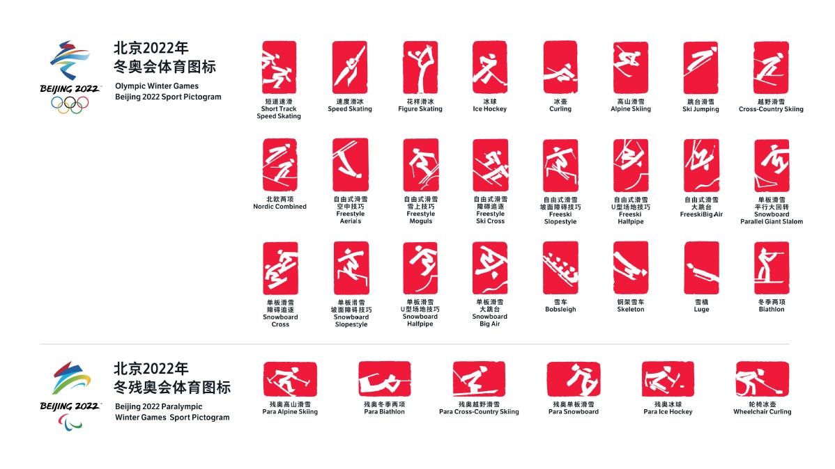
Sports pictograms for 2022 Winter Olympics in Beijing, Source: Chinadaily
The pictograms are also animated to the sound of Chinese drums, an upbeat rhythm full of energy almost like an uplifting heartbeat. Even though everyone was under tremendous time pressure because of the thousands of applications that needed to be created and produced, the team showcased their passion for excellence and delivered pure graphic design brilliance. I believe that these pictograms are iconic examples that future OCOGs have a lot to learn from.
Last but not least, the Look of the Games looks stunning in the venues but it looks fantastic on screen. With the invaluable assistance of OBS, the Beijing 2022 Winter Olympic Games Look of the Games is broadcasted around the world bringing the magic of the Olympic Games in our homes.
The Olympic Games, Olympism, the Olympic Ideals after their centuries long journey, were honoured for the second time in Beijing. This universal philosophy of life served humankind once again, through the athletes, the heroes of the Olympic Games, the global Olympic family but also through the visual identity and Look of the Games, created by the most talented and artistic team.
I am certain that the Beijing 2022 Olympic Games visual identity and Look of the Games will be considered as one of the most treasured in the Olympic Movement.
CAFA ART INFO: You have mentioned that CAFA (Central Academy of Fine Arts) was a special university for you. Could you explain the reason? And how do you think of the development in design education at CAFA over the past decade? Would you like to give any suggestion for young designers in China?
Theodora Mantzaris: The Central Academy of Fine Arts is the best Art and Design University in China and it is considered one of the best in the world. Every year a new team of students graduate with portfolios that are wonderful and full of new and innovative ideas confirming the fact that this University is a massive power house of creativity with vast amounts of potential to make our world a better place.
During the creative process of the Beijing 2008 Olympic Games, I collaborated and met with so many great Professors that inspired me. I have learned a lot from them because they introduced me to the wealth and depth of Chinese culture. Additionally, through the Professors’ work I was initiated to a new way of thinking, a completely different world that is very contemporary, full of meaning and ideas deriving from Chinese philosophy.
The Beijing 2022 Winter Olympic Games will be considered as the new blueprint to guide the next generations of designers when working on any future Winter Olympic Games design projects. A blueprint that was led by a CAFA Professor Lin Cunzhen, supported by the gigantic assistance of the University and its Research Center for the Olympic Games, the unique place in the world that students and all can get invaluable knowledge about the Olympic Games design history. China entrusted CAFA shape its distinctive and truthful national attributes into two Olympic Games visual identities. CAFA in return delivered Olympic excellence that will stand the test of time.


